TAKWEEN Business Advisory logo with a gold emblem on a dark blue background, featuring the text 'The Elite Partner For Uncompromising Leaders' and 'Visual Identity 2025'.

Takween

Client
Ahmed Al Kazweeny
Category
professional Logo design
brand story
Brand Identity
Stationary design

brand story :

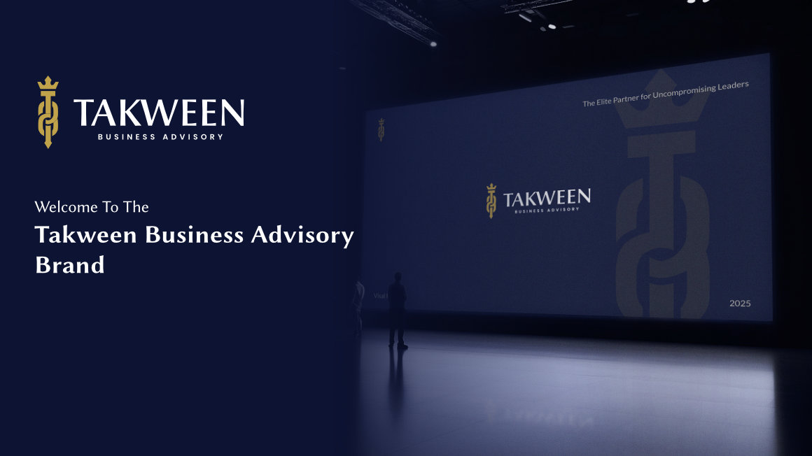
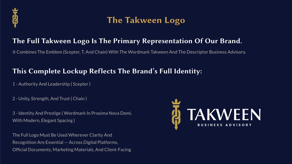
In a city where opportunity moves faster than traffic on Sheikh Zayed Road, a new name wanted to rise — not as another service provider, but as a trusted partner to visionaries.
That name was Takween.
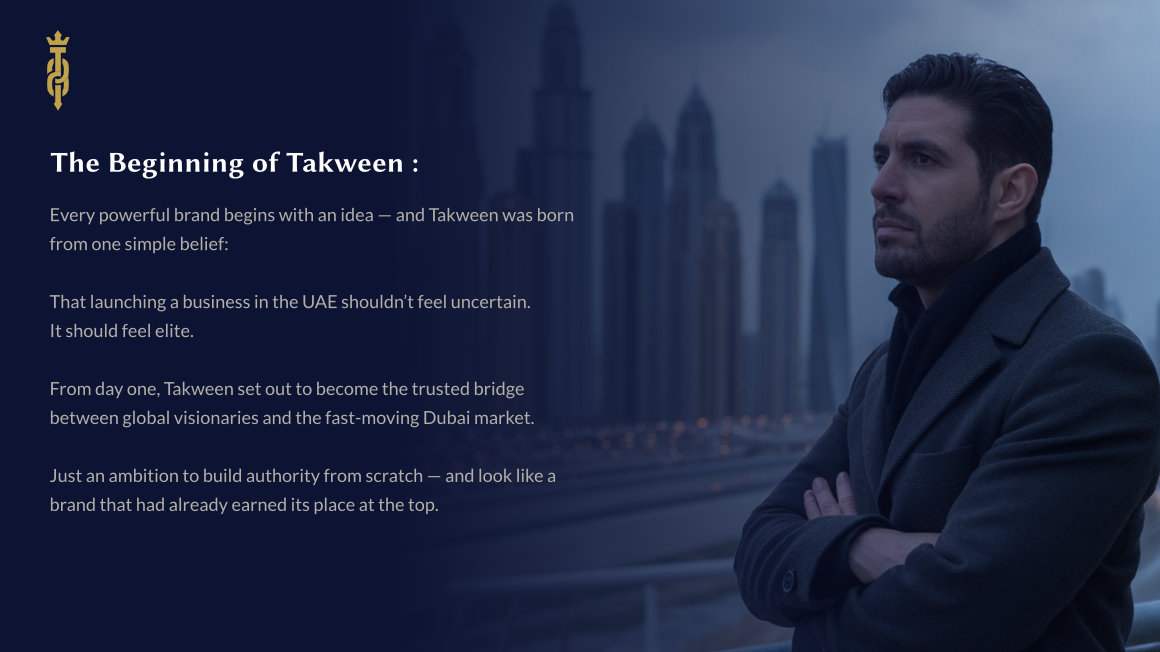
Before the first client meeting, before the first license was issued — they needed one thing:
A brand that looked like it had already earned trust.

No redesign. No legacy. Just a bold beginning.
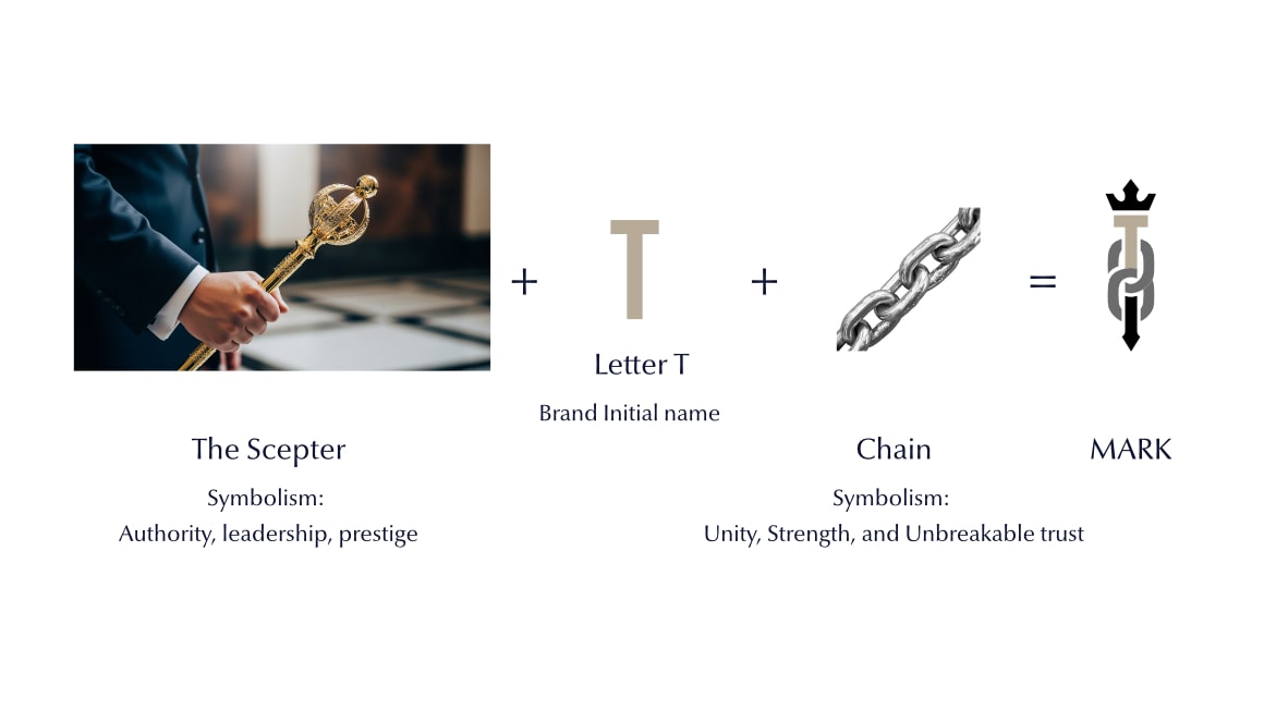
My role was to give that beginning a face — to create a visual identity that could walk into Dubai’s most competitive market and look like it belonged there from day one.

This is how Takween was built — not just as a logo, but as a statement of confidence.

Dark blue presentation screen with Takween Business Advisory logo and text stating it is the brand welcome, alongside a golden logo emblem.
Man in a dark coat and scarf thoughtfully looking to the right with a blurred Dubai skyline in the background and text about the beginning of Takween on the left.
Man in a suit holding a decorative scepter, looking thoughtfully to the side, next to text about the challenge of entering the Dubai market with trust and prestige.
Starting a business in Dubai isn’t the hard part.
Being taken seriously from day one — that’s the real challenge.
When Takween entered the market, they had no history, no reputation, no track record.
Just an ambition to serve the world’s most demanding clients — founders, investors, and corporations who expect perfection, speed, and trust.
But in a city full of established giants, perception is everything.
If you don’t look credible, you don’t get a chance to prove you are.
Takween’s challenge wasn’t operations.
It was perception — to look like a partner people could trust with million-dollar decisions, even before the first conversation.
The brand had to earn that trust instantly — visually, emotionally, and strategically.
Dark room with a reflective floor displaying Takween's vision and mission text about empowering visionary leaders in the UAE with flawless execution and unmatched service.
Gold metallic logo and text 'TAKWEEN BUSINESS ADVISORY' illuminated by three spotlights on a dark textured wooden wall.
The Takween logo displayed in four variations, featuring a vertical gold symbol with a crown above a stylized 'T' beside the word 'TAKWEEN' in uppercase letters, followed by 'Business Advisory' in smaller text.
Two versions of the Takween Business Advisory logo badges, one full colored in gold and navy, the other in black and white printing.
Explanation of the Takween logo elements with gold emblem and white wordmark on a dark blue background.
Creating a Brand That Leads From Day One
From the first sketches, every detail had a purpose.
We didn’t design “a logo.”
We crafted a visual identity that feels like leadership.

1 - The Scepter represents authority and guidance.
2 - The Chain represents unity and unbreakable trust
And together, they form the letter T — the mark of Takween.

It’s a logo that tells a story even before the company does:
A symbol for founders who refuse to settle.

We built everything else around that same philosophy — dark luxury tones, refined typography, minimalist compositions — to project quiet confidence and precision.
Concept showing a scepter symbolizing authority, the letter T as brand initial, and a chain symbolizing unity and strength combining to form a mark.
The Takween logo with usage guidelines, listing website platforms, corporate stationery, client presentations, and marketing materials as core brand communications.
Graphic explaining the Takween Badge (Secondary Mark) with usage guidelines and a badge design featuring a gold emblem inside a rounded arch with text 'BUSINESS ADVISORY' and 'TAKWEEN' below.
Blue textured background with gold Takween badge showing a stylized torch inside an arch with text 'BUSINESS ADVISORY' and 'TAKWEEN', alongside usage guidelines for the badge.
Color palette with five blocks labeled Navy Prestige, Desert Gold, Pure White, Soft Ivory, and Neutral Gray, each showing their hex, RGB, and CMYK values.
Brand Identity display showing two dark blue and gold business cards for Takween Business Advisory with logo and company vision statement.
Takween branded stationery set including an iPad displaying the company vision, smartphone, envelope, business cards, button pins, pencil, and paper clips on a dark background.
Corporate brand presentation showing Takween letterhead and business card on a dark blue background with gold and white text.
Dark blue lanyard with multiple logos and attached ID card featuring a photo and text, displayed on a dark blue background under the title 'Brand In Action'.
Two pens, one dark blue and one gold, each featuring a gold branded logo, displayed on a dark blue background with text 'Brand In Action' and 'Pen'.
Two round pins on a dark blue background, one showing the Takween Business Advisory logo and the other showing the pin's backside clasp.
Dark blue notebook with gold vertical stripe and Takween Business Advisory logo on the cover, placed on a navy background with text 'Brand In Action' and 'Note Book'.
Takween folder
Takween mug
Dark blue cargo van inside a building with TAKWEEN Business Advisory logo and gold emblem on its side.
Glass sign mounted on a building corner displaying the TAKWEEN Business Advisory logo and name.
LinkedIn profile preview of TAKWEEN Business Advisory showing their logo, title, tagline 'The Elite Partner For Uncompromising Leaders,' location UAE, contact info link, follower count, and action buttons on a dark blue background.
LET`S TALK
Result — A Brand That Arrived Ready

When Takween launched, it didn’t look like a newcomer.
It looked like it had been there all along.

The identity gave Takween instant credibility and a powerful sense of presence — allowing the brand to step into high-level conversations from its very first day in business.

Their message became clear:
“Don’t just launch. Arrive.”

Because Takween’s story isn’t about starting small — it’s about starting strong.

What This Brand Proves:

You don’t need years of history to look trustworthy.

You need clarity, confidence, and a design system that tells your story before you speak.Takween’s identity shows what happens when strategy and design align from day one —
a new brand that looks like a legacy from the moment it’s born.

Discover if Peter Melad is
the Perfect Fit for You
(Spoiler: It Absolutely Is!)

Get a guided tour through my portfolio, and
find out how you and me can change the way you source
design, forever.
start now