
A global brand that learned to speak in Arabic

“Collaborate with a renowned local graphic designer to create an Arabic version of our logo that reflects Convergint's global brand identity while respecting Arabic calligraphic traditions.”
Convergint Middle East Team runs marketing for Convergint Middle East. Convergint is a $2B global systems integrator. 11,000 colleagues. 250+ locations. The English wordmark had carried the brand for two decades. In every market where English carried weight.
Saudi Arabia was not one of those markets. Around 95% of serious competitors in systems integration, security, and life safety had already adopted Arabic in their logos. Al Salem Johnson Controls. Honeywell. MDS. Al Falak. NESAM. Convergint had not.
Direct competitors like Al Salem Johnson Controls, Honeywell, MDS, Al Falak, and NESAM had all localized to Arabic. Adjacent global brands operating in the region had done the same. Convergint was the outlier in the market it had decided to win.
Convergint Middle East Team had audited the Saudi competitor landscape and seen what nobody inside global was looking at. The brand was the outlier. Not by a small margin. By an entire market standard. She built the internal case herself, slide by slide, and walked it to global on June 7, 2024.
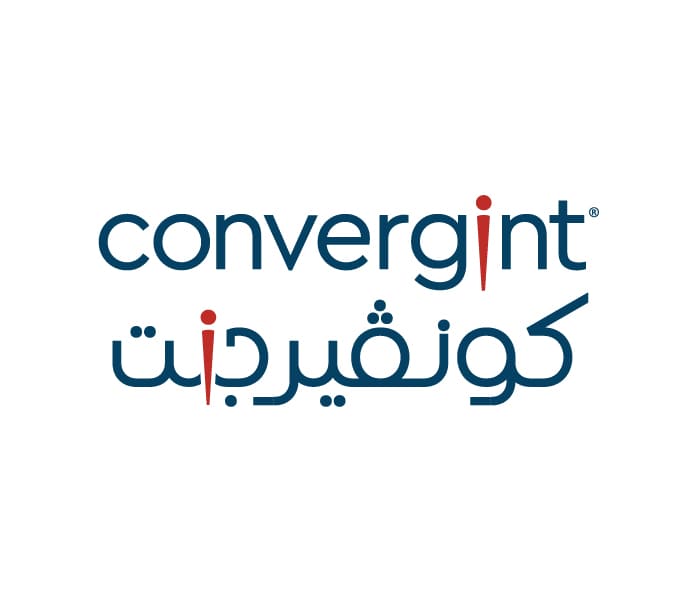
The deck was not a creative pitch. It was a market access argument. She named the competitors. She named the global brands already localized. Then she made the observation that defined everything that came next. The letter “i” in Convergint does not exist in Arabic. The letter that takes its place is ن. In Arabic, ن means “we.” Global approved the brief. The search for a designer began.
Before I drew anything, I asked the questions internal deck had already raised but no designer had answered.
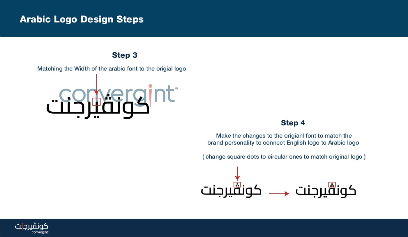
The strategic case had already been built by Fawzia. The job was to honor the case with a mark that earned its place inside a global brand system, not next to one.
Saudi market positioning audit
5 concepts explored
Bilingual system and regional rollout
The Founder Clarity Kit gave Convergint Middle East Team what they needed. A strategic frame before a single letterform was drawn.
The brand idea was already inside the name.
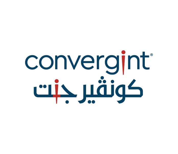
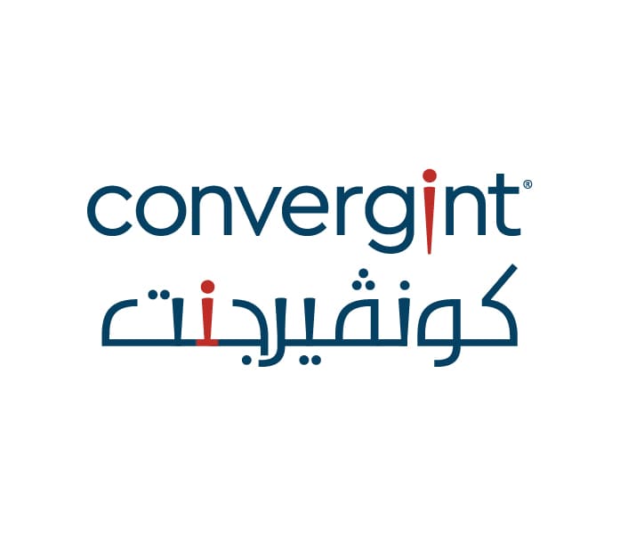
Five Arabic logo directions. One earned the brief


Convergint Middle East Team had been right about the letter. The strategic frame proved it.
“We have all independently come to the same conclusion. This is the one.”
The identity system. Built to carry the global wordmark into Arabic without breaking what made the brand Convergint.


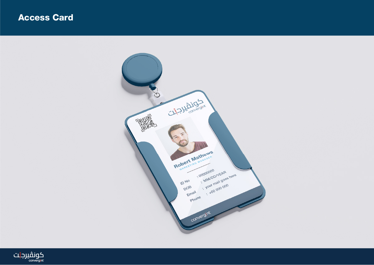


The Arabic mark, refined into a form that reads as Convergint at a glance in either language. Within weeks of delivery, the Arabic mark was live on the Convergint Middle East LinkedIn presence and entering the regional marketing system. Regional collateral stopped being translated and started being designed. The Arabic mark sat where it belonged, as the first thing a Saudi reader saw.
"it was great working with Peter"